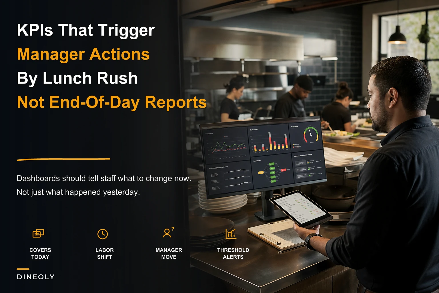

Your restaurant KPI dashboard probably looks impressive. Labor percentage at 28.4%. Table turns averaging 2.1. Food cost creeping toward 32%. But when your shift manager glances at these numbers during Saturday rush, do they actually know what to do? Or do they just nod, file it away mentally, and keep doing what they've always done?
Most restaurant dashboards fail because they display metrics without decision rules. They're scorecards, not playbooks. Your managers end up staring at numbers that tell them something's wrong but not what specific action to take right now to fix it.
Successful operators don't just track KPIs—they map each metric to explicit if-this-then-that decision trees. When covers drop below threshold, they know exactly which prep stations to slow down. When labor percentage spikes, they have predetermined shift adjustments ready to execute. The dashboard becomes an operational control panel, not a report card.
The fundamental problem with traditional restaurant dashboards
Traditional dashboards assume managers know how to interpret and act on metrics. They don't. Or more accurately, they know in theory but lack systematic decision rules for real-time situations.
Take a typical scenario: It's 6:47 PM on Friday. Your floor manager checks the dashboard. Table turns are at 1.4 instead of the target 2.0. Kitchen ticket times averaging 24 minutes versus the 18-minute standard. Labor sitting at 31% against a 28% target.
Now what?
Does she send someone home early? Call in reinforcements? Adjust the host stand pacing? Modify prep priorities? The dashboard shows problems but offers zero guidance on which lever to pull first, how hard to pull it, or what downstream effects to watch for.
This decision paralysis happens because restaurants typically build dashboards backward. They start with available data, create pretty visualizations, then hope managers figure out the operational implications.
What works is mapping each metric to a decision tree before you even build the dashboard. Every number needs an explicit action threshold and a predetermined response protocol.
Building decision trees that connect metrics to manager actions
A functional restaurant KPI dashboard needs three layers most operators miss: trigger thresholds, action protocols, and escalation paths. Without these, you're just displaying numbers.
Eliminate operational bottlenecks effortlessly.
Dineoly helps you manage every reservation, order, and staff shift seamlessly.
- Unified reservation and order management
- Real-time staff scheduling
- Inventory and sales tracking
No credit card required
Start with your covers forecast accuracy. Most dashboards show actual versus predicted covers—maybe 340 actual versus 380 predicted for dinner service. That's a datapoint, not a decision tool.
Covers Decision Tree
Threshold Level 1: Actual covers 15% below forecast (checked at 5:30 PM)
-
Shift lead cuts one prep cook at 7
00 PM
-
Auto-alert sent to kitchen manager
-
Adjust tomorrow's prep list by 15%
Threshold Level 2: Actual covers 25% below forecast (checked at 6:30 PM)
-
Release one server immediately, cut bartender at 8
00 PM
-
Alert GM with labor savings calculation
-
Text off-duty staff about potential schedule changes tomorrow
Threshold Level 3: Actual covers 35%+ below forecast (any time)
-
Execute "skeleton crew" protocol, 86 all prep-heavy specials
-
Send owner alert with P&L impact estimate
-
Trigger supplier order modifications for next day
Notice how each threshold maps to specific people taking specific actions at specific times. No interpretation required.
Labor percentage: from abstract metric to shift-change playbook
Labor percentage might be the most watched yet least actionable metric in restaurants. Everyone knows 28% is better than 32%, but what exactly should you do at 7:23 PM when you're tracking toward 31%?
Most managers default to sending someone home early—the bluntest tool in the toolkit. Labor decisions need more nuance based on service phase, upcoming reservations, and kitchen capacity.
Pre-Service Labor Alerts (2:00 PM - 5:00 PM)
-
Trigger
Labor tracking >2% above target
-
Action
Delay clock-in for non-essential prep staff by 30 minutes
-
Exception
Override if prep completion below 75%
Peak Service Labor Alerts (6:00 PM - 8:30 PM)
-
Trigger
Labor >3% above target + covers on pace
-
Action
Do nothing—maintain service quality
-
Note
Flag for post-shift review, not real-time cuts
Wind-Down Labor Alerts (8:30 PM - close)
-
If covers <80% of forecast
Cut to minimum coverage immediately
-
If covers 80-95% of forecast
Stagger cuts starting with newest staff
-
If covers >95% of forecast
Maintain staffing, accept labor overage
The dashboard should display not just current labor percentage but also projected end-of-shift percentage based on remaining scheduled hours. More importantly, it should show the specific action required based on current conditions.
One Mediterranean spot had their managers constantly overcutting during service, creating quality issues. After implementing threshold-based rules, they found that accepting temporary labor spikes during peak hours but executing aggressive cuts during setup and breakdown actually improved both service and overall labor percentage.
Table turn optimization through host stand decision rules
Table turnover rate sits on every dashboard, but hosts rarely know how to influence it operationally. They see "1.8 turns" and think it's purely about how fast customers eat.
The real control happens through micro-decisions at the host stand. Smart dashboards don't just show turn rates—they trigger specific seating protocols based on current performance.
Turn Rate Decision Framework
-
Auto-alert host
"Switch to quick-turn seating mode"
-
Seat all 2-tops at bar tables first
-
Skip rotation for 4-tops if high-tops available
-
Offer waiting guests bar seating with 15% discount
-
Pre-bus aggressively—clear plates within 2 minutes of finishing
When turns are on target (1.8-2.2):
-
Maintain standard rotation
-
Normal pre-bussing schedule
-
No seating modifications needed
When turns are running fast (above 2.2):
-
Alert
"Quality check mode"
-
Slow down seating pace by 5 minutes
-
Have manager check in with rushed-looking tables
-
Verify kitchen not pushing tickets too fast
The dashboard needs to calculate rolling 90-minute turn rates, not just shift averages. A host needs to know their turn performance right now, not what happened three hours ago.
Kitchen metrics that trigger prep and production adjustments
Kitchen dashboards usually focus on ticket times and order accuracy. Useful for post-shift analysis, useless for real-time decisions. Your KM needs triggers that tell them when to adjust prep pars, modify cook deployment, or change production batch sizes.
Instead of just showing average ticket time, map it to production decisions:
Ticket Time Triggers
18-22 minutes (target zone):
-
No action needed
-
Dashboard shows green status
23-27 minutes (caution zone):
-
Alert
Check specific station bottlenecks
-
If grill
Start pre-marking proteins
-
If sauté
Prep additional mise en place
-
If salad
Add floater for next 30 minutes
28+ minutes (critical zone):
-
Alert
Execute overflow protocol
-
Move expediter to assist bottleneck station
-
86 any dishes from problem station requiring >5 minute cook time
-
Send GM notification with recovery ETA
But ticket times are just one dimension. Food cost variance needs similar treatment:
Daily Food Cost Variance Triggers
Running 0-2% over target:
-
Monitor only, no action
Running 2-4% over target:
-
Alert
Portion audit required
-
Check
Protein portions at grill station
-
Check
Sauce portions at sauté
-
Verify
No unauthorized comps
Running 4%+ over target:
-
Immediate investigation protocol
-
Spot audit next 10 plates
-
Review waste log for unusual entries
-
Check POS for missing modifications/upcharges
Kitchen triggers must be specific and fast. Vague guidance is useless when a 30-minute ticket time spike can cascade across the entire service.
Sample dashboard wireframes that actually drive decisions
Most restaurant dashboards look like airplane cockpits—dozens of metrics competing for attention. Effective operational dashboards follow different design principles: hierarchy, context, and actionability.
A wireframe structure that works:
Primary Display (always visible)
| Component | Display |
|---|---|
| Current Status | Green/Yellow/Red |
| Next Required Action | Specific instruction |
| Time Until Next Check | Countdown timer |
Service Phase Modules (contextual display)
Prep Phase (2:00 PM - 5:00 PM):
-
Prep completion
68% [BEHIND - Add prep cook?]
-
Staff on clock
8/11 [3 pending arrival]
-
Tonight's covers
320 projected [85% of typical Friday]
-
Action needed
Reduce protein prep by 15%
Service Phase (5:00 PM - 10:00 PM):
-
Current covers
187 [On pace for 340]
-
Labor running
29.3% [Projected 28.8%]
-
Avg ticket time
21 min [No action needed]
-
Table turns
1.7 [Below target - execute quick-turn protocol]
Close Phase (10:00 PM - midnight):
-
Remaining covers
12
-
Labor opportunity
Cut 2 servers save $67
-
Prep needs tomorrow
Reduce by 20%
-
Break down stations
14, 15, 16 first
Each metric displays with its action threshold and current recommendation. Managers shouldn't need to remember what 29.3% labor means—the dashboard tells them explicitly.
Alert hierarchies and notification routing
Not every alert needs everyone's attention. Kitchen running five minutes behind doesn't require owner notification, but food cost jumping 6% absolutely does.
Build your alert routing with clear escalation paths:
Level 1: Shift Lead Alerts (handle immediately)
-
Ticket times 5-10 minutes over target
-
Labor 1-3% over target
-
Single station backup
-
Minor inventory shortage
Level 2: Manager Alerts (handle within 30 minutes)
-
Ticket times 10+ minutes over target
-
Labor 3-5% over target
-
Multiple station delays
-
Critical inventory shortage
-
Staff no-show/walk-out
Level 3: GM/Owner Alerts (strategic decisions)
-
Labor 5%+ over target
-
Food cost 4%+ variance
-
System-wide service failure
-
Revenue 20%+ below forecast
Each alert should include three components: what happened, what action to take, and expected outcome. "Food cost running 4.8% over target. Audit protein portions immediately. Should recover 2% through portion control."
Connecting front and back of house metrics through unified triggers
The most expensive problems happen when FOH and BOH metrics disconnect. Front's turning tables at 2.3 while kitchen's drowning with 28-minute tickets. Or kitchen's fully staffed while servers are overwhelmed with a surprise rush.
Your dashboard needs cross-functional triggers that keep both sides aligned:
Cover Flow Coordination
-
FOH Alert
"Prepare for rush - check station readiness"
-
BOH Alert
"Heavy seating wave incoming - start protein pre-fire"
-
Host instruction
"Pace seating - 3 minute intervals"
Service Recovery Protocol
-
FOH Response
Send manager to waiting tables with appetizer samples
-
BOH Response
Expediter takes over problem station
-
Host Response
Quote 10 minutes additional on wait times
-
Manager alert
"Service recovery mode - visit all affected tables"
This coordination prevents the cascade failures that kill service. FOH knows when BOH is struggling before guests complain. BOH gets warning before surprise rushes hit.
Practical implementation: rolling out decision-based dashboards
Switching from passive metrics to active decision systems requires careful rollout. Dumping a complex decision tree on your team Monday morning guarantees failure.
Start with one metric, one decision. Pick your biggest operational pain point—maybe it's labor overages. Build just that decision tree first. Run it for two weeks. Let managers get comfortable with threshold-based actions before adding complexity.
Week 1-2: Single metric pilot
-
Choose labor or covers
-
Create three simple thresholds
-
Test with just shift managers
-
Document every decision and outcome
Week 3-4: Expand to related metrics
-
Add connected metric (if labor, add covers)
-
Create interaction rules
-
Include assistant managers
-
Refine thresholds based on data
Week 5-6: Full implementation
-
Add remaining critical metrics
-
Build complete decision trees
-
Train entire management team
-
Create quick reference cards
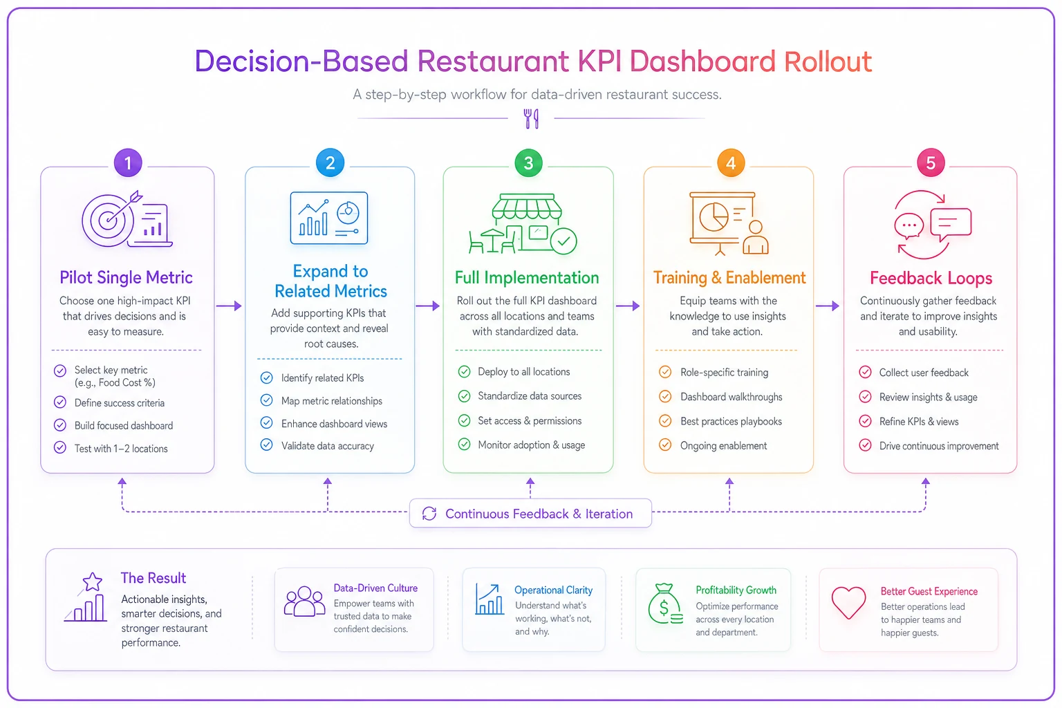
A clear rollout workflow helps teams adopt changes gradually.
The goal isn't perfection immediately. You're building operational muscle memory. Managers need to trust that following dashboard instructions leads to better outcomes than their gut instinct.
Measuring whether your decision rules actually work
Most operators never validate whether their thresholds and actions improve performance. They set rules based on theory, then assume they're working.
Track decision effectiveness with simple outcome metrics:
For labor decisions:
-
Did following the alert achieve target labor percentage?
-
Did service quality metrics hold steady?
-
How often did managers override the system?
For prep decisions:
-
Did threshold-based prep adjustments reduce waste?
-
Were there stockouts after following reduction protocols?
-
How accurate were next-day needs predictions?
For service decisions:
-
Did table turn protocols actually increase covers?
-
Did quality scores change with faster turns?
-
What was guest satisfaction impact?
After 30 days, you'll have clear data on which rules work and which need adjustment. Maybe your 15% cover variance threshold is too sensitive, triggering unnecessary labor cuts. Or perhaps 25-minute ticket times aren't actually affecting guest satisfaction if servers manage expectations properly.
Systematic decision rules are testable and refineable. Unlike gut-instinct management, you can measure, adjust, and improve continuously.
Making dashboards work without complex software
You don't need a $50,000 dashboard system to implement decision-based KPIs. A basic POS system, spreadsheet, and clear protocols get you 80% there.
Minimal viable setup:
Morning Setup (10 minutes)
-
Pull yesterday's numbers from POS
-
Enter into simple spreadsheet with threshold formulas
-
Spreadsheet generates today's decision triggers
-
Print single page with today's thresholds and actions
-
Post at host stand, kitchen pass, and manager station
Hourly Checks (2 minutes)
-
Manager checks current metric against threshold
-
If over threshold, execute predetermined action
-
Log action taken in shift notes
-
No analysis, no debate—just execute
End of Shift (5 minutes)
-
Record actual outcomes
-
Note any threshold overrides and why
-
Calculate whether actions achieved targets
-
Single paragraph summary for next shift
This manual system lacks real-time alerts and automatic calculations, but it builds the operational discipline needed for success. Once your team trusts decision rules and sees results, investing in restaurant KPI dashboard software makes sense.
The automated version takes the same logic and removes friction. Instead of hourly manual checks, the system monitors continuously. Instead of printed threshold sheets, managers get mobile alerts with specific instructions. The AI automation handles the monitoring and alerting, while managers focus on execution.
But automation without good decision rules just means faster failure. Build the operational logic first, then accelerate it with technology.
The path forward: from metrics to management
Every restaurant tracks metrics. The successful ones translate those metrics into specific manager actions through clear decision rules. Your dashboard shouldn't just tell you labor is high—it should tell you exactly who to cut, when, and what the impact will be.
Start tomorrow with one decision rule. Pick your most painful metric. Define three threshold levels. Map each to a specific action. Test it for a week. Refine based on outcomes. Then add another metric.
Within 60 days, you'll have transformed your dashboard from a scorecard into a playbook. Your managers will stop guessing and start executing. Your operations will become more consistent, predictable, and profitable.
The difference between restaurants that scale successfully and those that hit operational walls isn't the metrics they track—it's how systematically they translate those metrics into action. Make your dashboard work for your managers, not the other way around.
Ready to elevate your restaurant operations?
Join 2,000+ restaurants using Dineoly to enhance efficiency, increase table turnover, and delight diners.